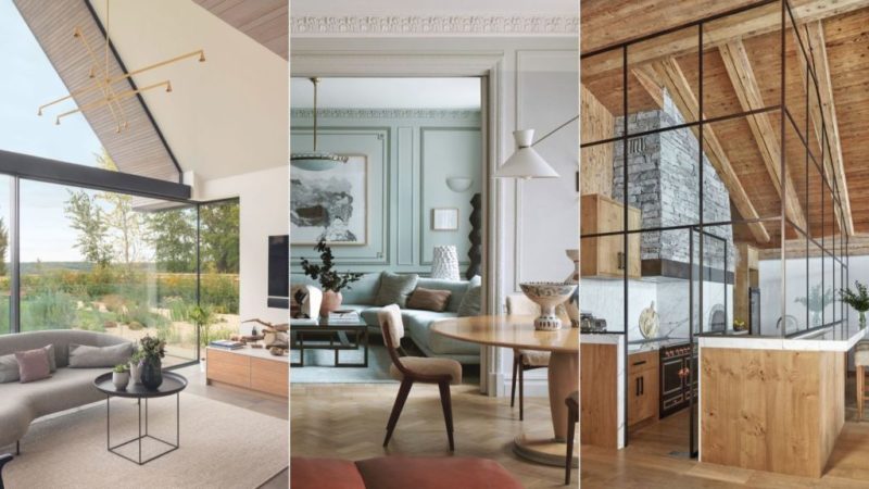
Decorating and designing with glass ranges from introducing weight-bearing structures to simple but cleverly placed mirrors. All will work to make a house lighter
Making a house lighter can be as simple as bringing more mirrors or glazed panels into your home, or as complicated as replacing sections of roofing with glazing.
Here, we explore the best ways to get more light into a house to brighten rooms; some are quick and easy to choose, others mean rethinking your house design.
1. RAISE THE ROOF WITH GLASS
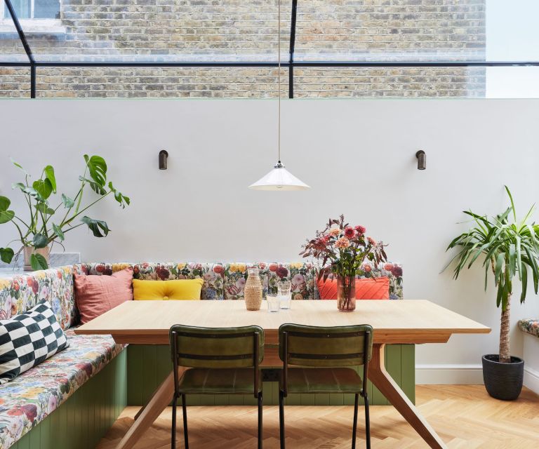
Squeezing out extra floor space in a city house so often involves digging down into the basement level. While traditionally these rooms were dark and dank, this is where advancements in glazing really add a wow factor.
Here, a fully glazed infill designed by Studio Elephant Architects almost entirely distracts from the feeling of being semi submerged. Interior designer Lizzie Green says the setting of almost seamless glazing gave her carte blanche to 'push the dial with print and color' when it came to decorating the space.
'We went for a bold banquette, designed for entertaining and squeezing in as many people around the table as possible,' she explains, adding she chose vibrant florals against the neutral backdrop to maximize the light in the space.
2. SWAP SOLID DOORS FOR GLAZED
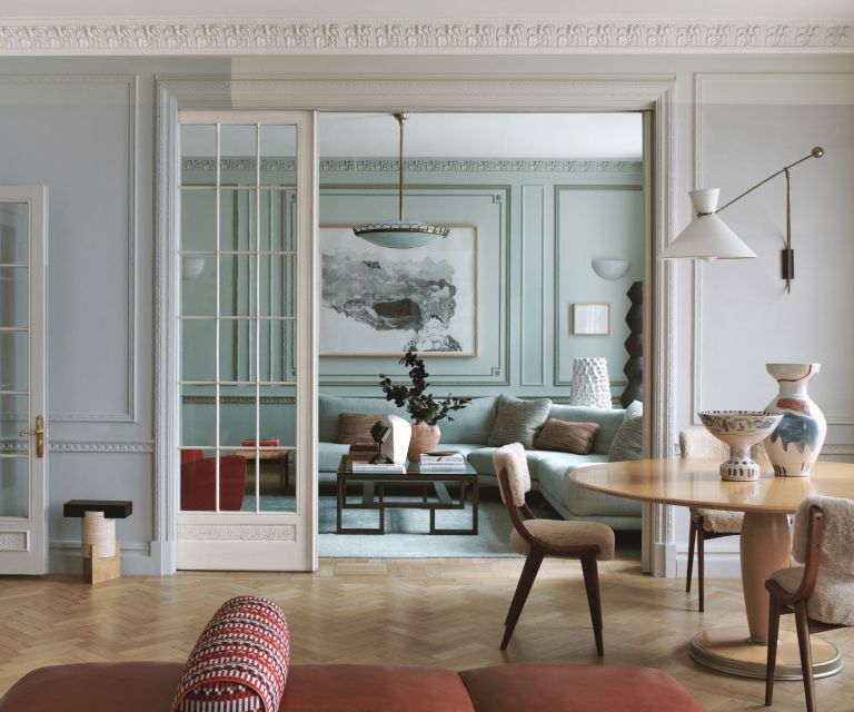
Glass pocket doors are an elegant solution for rooms that lead off other rooms – they negate the need for yet more floor space left free for door openings.
This dining area leading through to a reading room or library is from a project by Maddux Creative. The doors are original to the 1920s-era building (just before hinged versions took over in popularity).
While the doors create a physical divide between the two spaces, the decorators have used paint to also help with the transition. The walls feature a color-block paint effect, adding a subtle contemporary twist to the original moldings – a technique that almost looks like shadows rather than changes in paint color, notes the architect and co-founder Scott Maddux.
'Color experimentation continued in the adjoining library with three different shades of green to highlight the moldings,' he adds.
3. BRING THE OUTDOORS IN
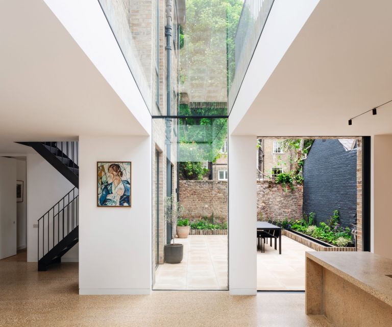
When looking for a material to join two existing buildings together with the aim to create a larger property, glass is increasingly the go-to option. Not only will it neatly bridge the gap between the two interior spaces but it also immediately opens up the link between the inside and outside.
'Our focus was to maintain the visual connection to the courtyard,' explains Kieran Morgan, director of Found Associates, an architectural and interiors studio. 'This was achieved by introducing a glazed link that replicated the original path to the courtyard while also delineating the existing building from the new extension and bringing natural light into the open plan kitchen and dining space.'
4. USE FLUTED GLASS FOR PRIVACY
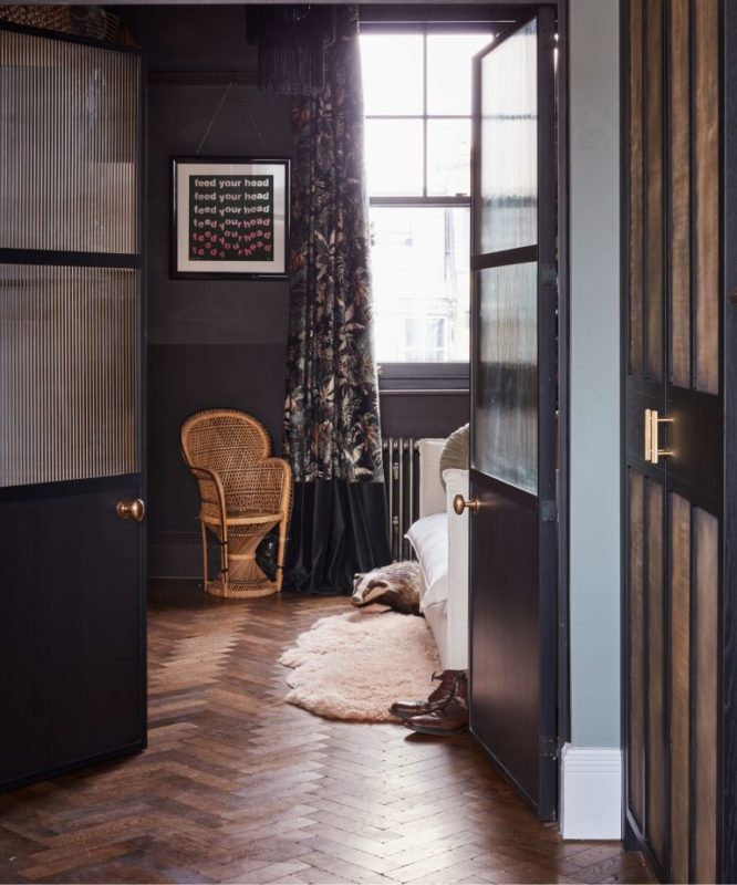
Use fluted or reeded glass panels in sliding pocket doors as a light-touch way to separate spaces between bedrooms and bathrooms or bedrooms and dressing rooms. The result will keep the two spaces sewn together while adding a subtle level privacy at the same time.
Fluted glass is beautiful and timeless, believes Anna Burles, co-founder of the interiors studio Run for the Hills. 'It’s a little bit edgy, modern and you might think industrial – especially fitted in Crittall steel-style doors. But ribbed style of glass was all the rage in the early days of the Art Deco movement so it's not new or industrial at all.'
Here, she’s used British Standard Crittall double doors as dividers between her bedroom and dressing room. 'It does the perfect job of obscuring the view while still letting light pour through.'
5. INTRODUCE ARCHED WINDOWS TO SIGHTLINES
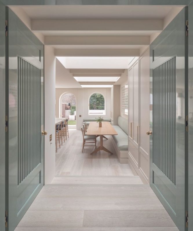
Arched windows are undeniably softer than standard ones with squared off corners and are a gentler way to frame views to the garden while allowing even more natural light into a room.
This kitchen, which features a set of arched windows and doors complemented by abundant roof lights, was designed by the architectural practice Flower Michelin with interiors by Salvesen Graham.
'From the outset, we developed a strong design narrative based around the arch, inspired by the two glass framed arches above the existing front door and the brickwork detailing to the front elevation,' explains Alex Flower, partner and co-founder of Flower Michelin.
The arch became an important visual element that repeats and defines the spatial hierarchy in the house.
6. BOOST SPACE AND LIGHT WITH A MEZZANINE
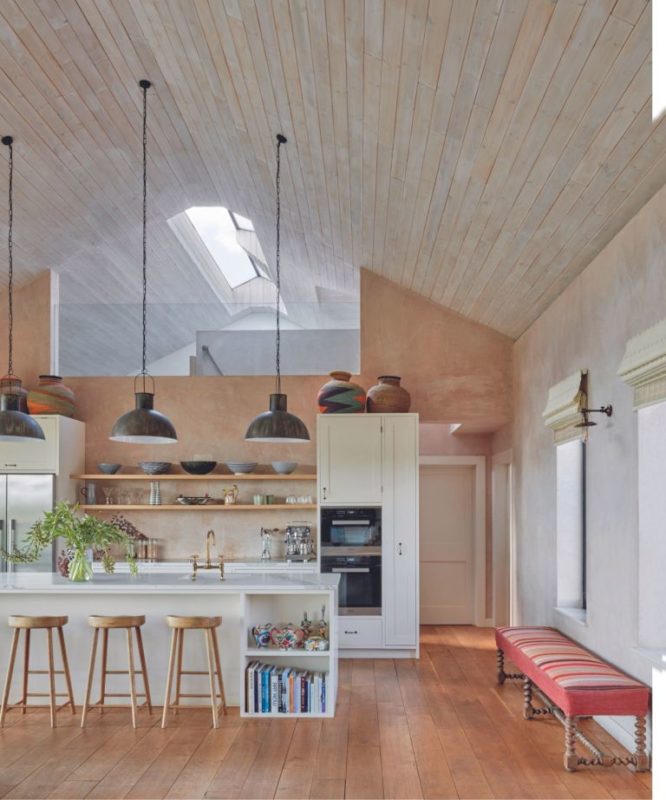
Mezzanines are a regular feature in barn conversions where planning constraints around existing openings make it almost impossible to create an entire first floor despite the generous ceiling heights.
The solution is often to carve out a balcony level at either end of the space. Glass has been used to introduce light and ease the transition between the mezzanine level and the rest of the open plan kitchen living room in this weekend home.
The upper level is a play area for the owners’ children; they can observe what’s happening down below through the glass panel. Interior decorator Kate Guinness designed the room which features unpainted plaster walls and custom-built cabinetry.
7. INTRODUCE BROKEN-PLAN LAYOUTS WITH GLASS
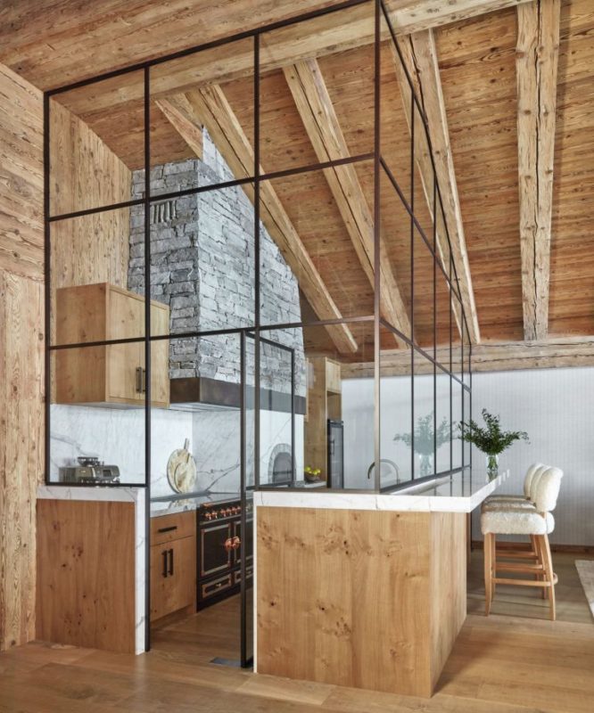
The challenge of open plan kitchens is that, even with the best-in-class extractor fans, it’s not always possible to keep cooking aromas from escaping into the rest of the space.
The solution to make a kitchen lighter, as well as the space beyond, is having glass walls (providing someone is willing to clean them frequently). Broken plan kitchens allow all the action to be visible and the room remains firmly connected to the rest of the house rather than being shut away behind solid walls.
This is the approach that interior designer Katharine Pooley took when re-designing this chalet overlooking the Matterhorn in Switzerland. She’s paired this eye-catching double height glazed room with lots of natural materials such as local stone and reclaimed timber.
'It’s a layered contemporary feel that showcases richly textured, contrasting finishes that fits perfectly with the open-plan layout,' explains Katharine.
8. FIT AN INTERNAL WINDOW
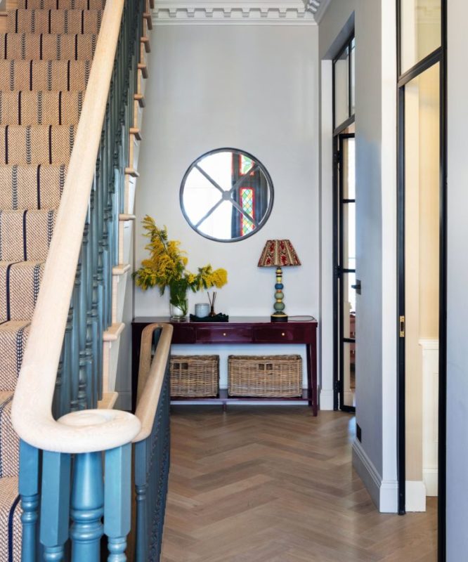
Hallways and entryways are notoriously lacking in natural light but one way to overcome this is to open up a porthole window in the far end. Not only will it introduce an interesting design feature but with the right alignment it might also allow for long views into the yard from the front door – quite unusual in an urban setting.
'By doing this, we brought light into an otherwise dark and gloomy space but I also love the way it reflects the stained glass in the front door when the light is falling in a certain way,' adds decorator Sarah Brown who designed this house. She has embraced glass extensively in this space with two full-height glass doors replacing traditional solid ones leading off the two main living rooms.
9. FIT GLASS PANELS IN OPEN-PLAN SPACES
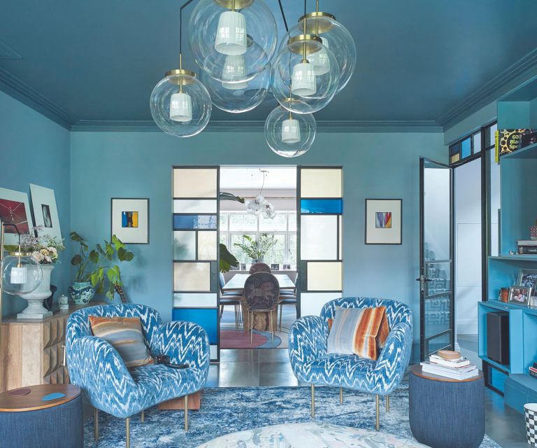
Once reserved for church windows and Victorian front doors, colored and stained glass is cropping up in more and more interiors as bright room dividers, bathroom screens and patio doors.
They create strong focal points, particularly against neutral backgrounds. For anyone nervous about investing in such a design, there are companies which are producing colored glass panels for doors which is a slightly less risky (and expensive) approach.
In the case of this scheme, interior designer Rachel Chudley came up with the design both for the main sliding doors and the glass lights above the entrance door.
'We particularly loved the original stained-glass windows in this house,' explains Rachel. 'We decided to pay homage to these with a contemporary style of stained glass designed in our studio for the internal Crittall doors.'
10. CREATE A GLAZED CORNER
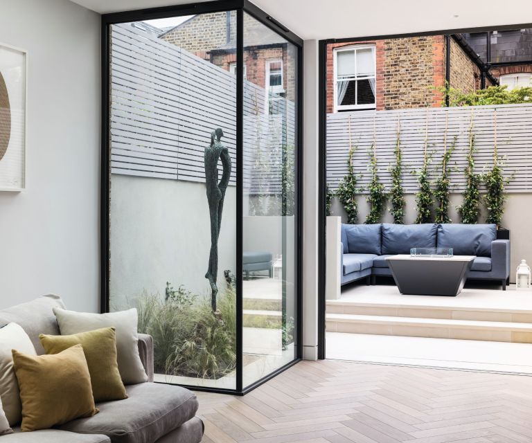
It’s tempting to make the most of internal floorspace when extending a property but have a think about whether there might be an opportunity to carve out a feature instead of opting for straight wall finish. Architectural glazing is the term used when very large panes of glass are used in lieu of walls to create views to the backyard.
In this scheme the team at Jo Cowen Architects have created a landscaped corner framed by full-height glass screens which forms part of the living room of this house.
'It both visually and physically connects the garden to the living spaces of the house,' says Giles Hoeg, a director of the firm. 'The result brings the outdoors inside,' adds Gemma Gordon-Duff of the interior design studio Gordon-Duff & Linton.
11. INCLUDE A GLAZED PANEL
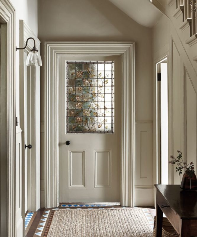
While stained-glass doors traditionally feature bold color combinations, other quieter alternatives create just as much impact – if not more so, because of their originality.
This entryway was decorated by Emma Milne and features in Selina Lake’s book Heritage Style. 'The door was existing and we made sure the paint colors and surrounding elements enhanced rather than distracted from the beautiful hand-painted stained glass,' explains Emma Milne.
'The design being quite soft and organic, we kept the paint colors natural and earthy to complement. We also painted everything in one color, the trim, baseboards, door, walls and ceiling so that the eye is drawn to these features and the stunning glazed door, rather than the difference in the paint finish.'
12. LOOK UP
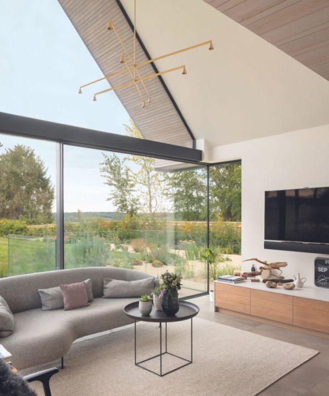
Structural glazing is used to describe glass that is integral to the design of the building and usually involves large glass panels which often bear some of the weight of the structure. It’s often used for contemporary houses built by the waterside or deep in rural countryside to make the most of the expansive views.
'If you are looking to create a double height glass elevation, the key thing to consider is ensuring the glass is designed to take all wind loads,' explains Rebecca Clayton of IQ Glass who designed this scheme where the glass panels have been shaped to meet the planes of the roof. 'Glass at high levels is exposed and needs to be strong enough for the specific location.'
13. ADD DEPTH WITH MIRRORS
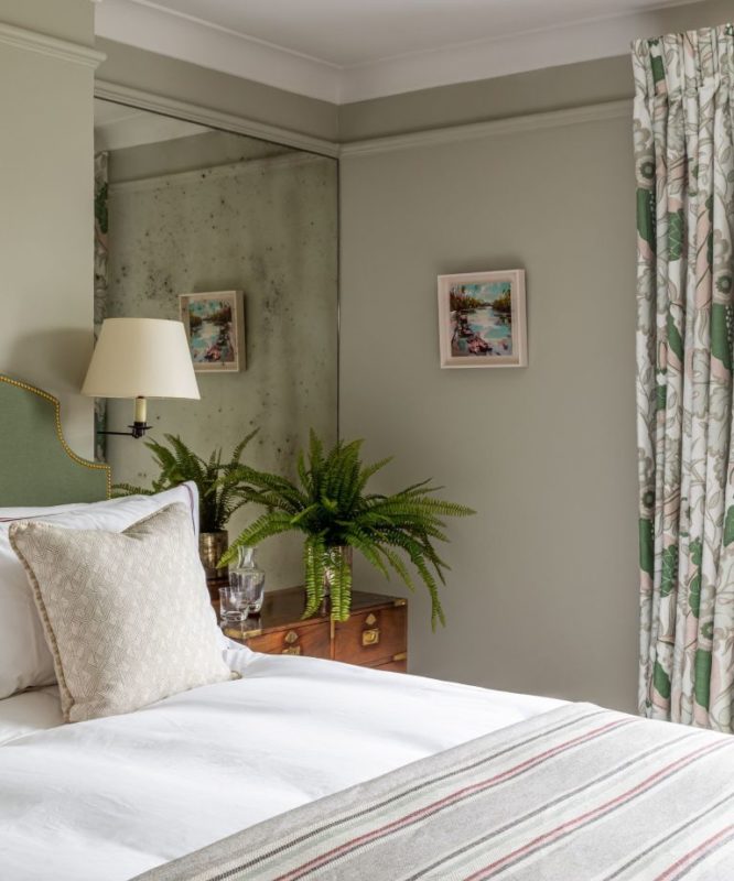
Antique mirrored glass panels are sometimes found over a chimney breast where the mottled reflection captures the flicks of flames in the fire grate but another useful context for decorating with mirrors is in rooms where there is a need to create an illusion of space.
In this bedroom Ali Johnson and Alex Keith, co-founders of the interior design studio Otta, chose to fit bespoke antique mirrored glass panels either side of the bed for two reasons.
'Firstly, being on the smaller side, the mirrored glass helps to create a sense of depth and bounce light around the bedroom, thus making the space feel larger than it really is. Secondly, our brief was to create a British colonial look and feel. The antique mirror is a gently exotic nod to a bygone era. The patina and finish adds interest and a softness appropriate for a calming bedroom.'
14. USE GLAZING TO DIVIDE A STUDIO
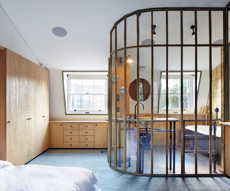
Breaking down the physical barriers between bedrooms and bathrooms began in the boutique hotel world where baths were increasingly being placed in bedrooms. For obvious reasons, there’s still a need to retain some distinction between the two spaces which is where glass panelling comes into play.
In this scheme by De Rosee Sa, a faceted screen was incorporated to work with the pitched ceiling of the mansard roof to prevent the room from being boxed out with a corner bathroom.
'The bathroom was designed with the intention of retaining the existing spatial proportions of the room and giving the client that open plan living, while also creating subsections within the room,' explains co-founder Claire De Rosee.
'The palette of materials used throughout was very rich, from the glass panelling to the intentionality of using a zinc primed and powder coated, toughened glass which then wrapped around the bathroom area, creating an oasis without jeopardizing the space in the room.'
15. BUILD A GLASS BRICK WALL
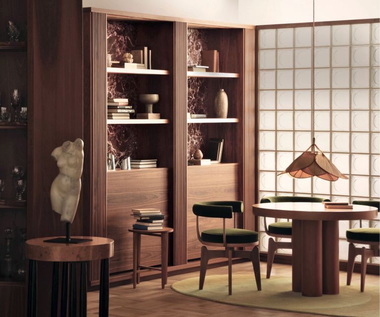
Glass bricks are often associated with the Modernist movement of the 1930s, especially South Beach in Miami, and the industrialist trend of the 1980s. Yet today, look around – especially in commercial spaces such as the design of new restaurants – and there’s a clear resurgence in their use.
They are also making their way back into domestic spaces as demonstrated in this scheme by Child Studio. In this dining room, the team has used custom library cabinets with deep red Russo Levanto marble cladding. This room is separated from the neighboring kitchenette by a glass brick partition.
'This allows the daylight to filter softly through the geometric pattern,' explain the co-founders Alexy Kos and Che Huang. 'The combination of dark mahogany wood, patterned marble and green upholstery feels so chic, yet warm and unpretentious.'
16. CREATE PARTIAL PARTITIONS
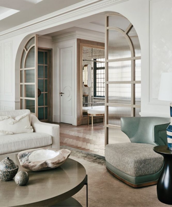
Partial partitions are a subtle way to distinguish between rooms without creating more definite physical barriers. The use of reeded glass and eye-catching wooden frames will help to draw attention to them as architectural features of a room.
When used in an entryway, they help set the tone for the rest of the house.
'We're enjoying using large glazed panels alongside a contrasting, highly textural material,' explains Deborah Base, founder of Base Interiors who designed this scheme. 'We recently completed a home with expansive glass panels fronted by slatted iroko screens, adding interest and depth to the façade and also increasing the privacy of the internal spaces.'
Source: homesandgardens.com


